In QuoteWerks Web, the Layout Designer is used to customize the printed output both for individual documents like a quote, order or invoice. Each has similar functionality, but are used differently. The following article defines what a layout is as well as how to access, edit and use them.
Navigate the following topics to learn how to use the Layout Designer in QuoteWerks Web:
To access the Layout Manager navigate to Setup -> Layout Designer from the left hand navigation panel.
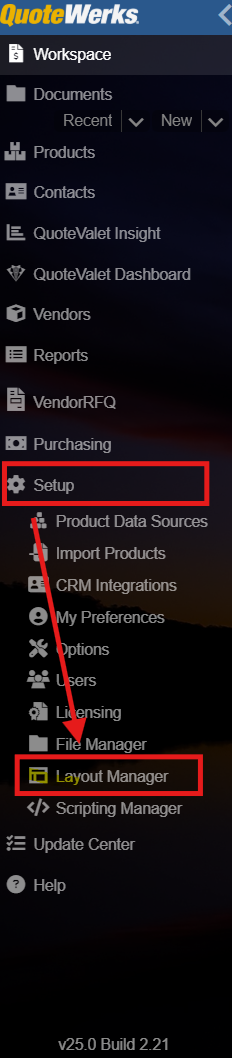
The Layout Designer will open and will list all of your saved layouts down the left side of the window.
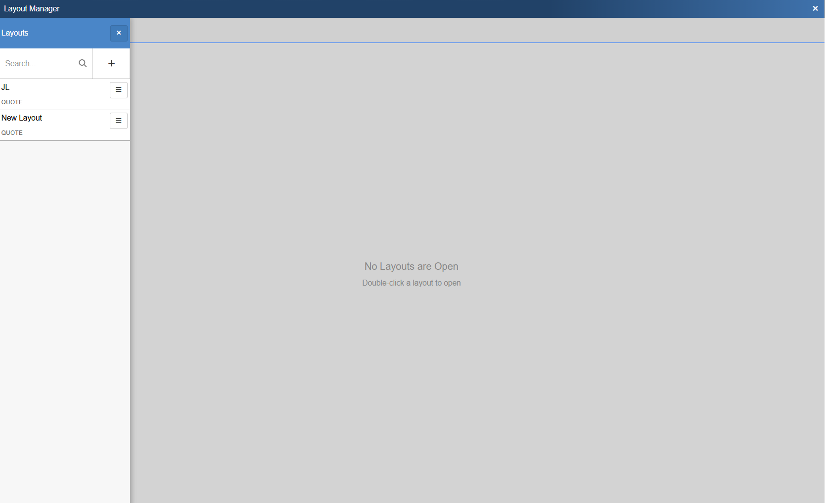
To create a new layout from scratch or from an existing layout, click on the  button. This opens the New Layout Window. To select an existing layout double click to open it in the Layout Editor.
Below is what a new, unpopulated layout looks like. There are a number of elements on this page, which are outlined below.
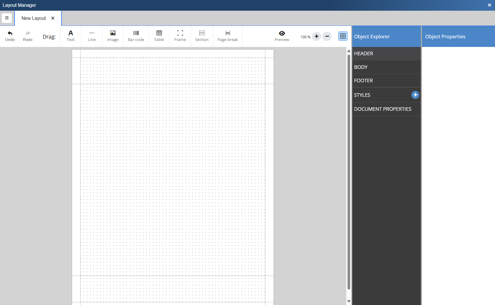
The following options are available across the top toolbar in the Layout Editor.
 These buttons can be used to undo and redo changes withing the Layout Editor.
 This button will open a preview of the currently open layout populated with sample data.
The options below can be added to a document by dragging them onto the grid.
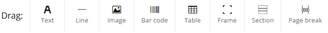

The Text button creates a text box where you can input static text, expressions, or pull a field(s) from an available table. A text element can consist of static text, parameters, a combination of both or an expression to be evaluated (see expression syntax). Predefined styles can be applied to text as well. Enable rich text to assign different styles to a single text element. Rich text also allows parameters but doesn't support expression evaluation.

The Line button inserts a horizontal line into the layout. The horizontal line supports adjustable width, height and color.

The Image button allows you to select a .JPG or .PNG file to be inserted into the layout.

The Bar code button inserts a bar code into the layout. The following codes are supported
•Code128: One of the most versatile barcodes and supporting all 128 ASCII characters. See ASCIItable.com for a list of supported characters.
•Code39: Defines 43 characters, consisting of uppercase letters (A through Z), numeric digits (0 through 9) and a number of special characters (-, ., $, /, +, %, and space).
•EAN-13 / UPC: Standards identifying a specific retail product internationally. It consists of 12 numbers plus a checksum number. EAN-13 codes beginning with 0 are actually 12-digit UPC codes with prepended 0 digit.
•EAN-8: Derived from EAN-13 for smaller packages. It follows the same logic (7 numbers plus a checksum number).
•QR Code: Can contain any characters.

The Table button inserts a new table into the layout. A table is used for presenting lists of values, such as invoices, statistics, or shipping items. To print dynamic data a table needs a parameter list as its data source.

The Frame button inserts a frame into the layout. Frames serve as versatile containers for elements, providing organization and visual enhancements. Here's how to effectively use frames:
•Container for elements: A frame acts as a container for other elements, creating a cohesive grouping.
•Dynamic sizing: A frame acts as a container for other elements, creating a cohesive grouping.
•Grouping elements: Use frames to group elements together, ensuring they stay connected and don't split on a page break.
•Styling options: Apply borders or backgrounds to the entire frame, enhancing the visual presentation.
•Positioning: Elements within a frame are positioned relative to the frame, while the frame itself is positioned in relation to the page.
•Movement impact in report design: Moving the frame affects its contents, making it a convenient way to reposition and organize multiple elements simultaneously.

The Section button inserts a new section into the layout. Similar to tables, sections require a parameter list as a data source. The key distinction to a table is that sections are not limited to text elements, providing flexibility for grouping whereas a table displays data line by line.

The Page break button inserts a manual page break into the layout.
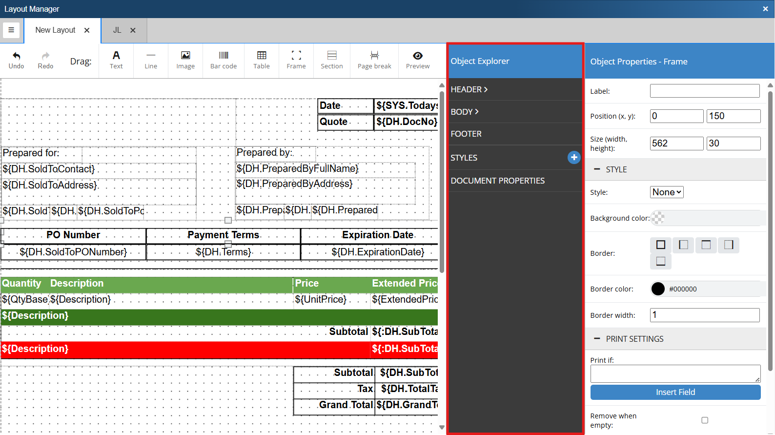
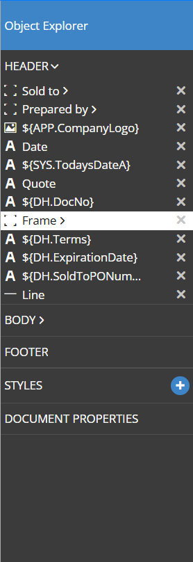
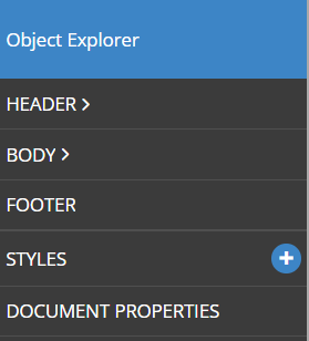
As you add objects to the layout they will show within the object explorer. From here you can select and edit objects. The object explorer breaks the document into sections. The following sections are available in the Object Explorer:
•Header - This section lists all objects contained in the document header. By default the header prints at the top of each page.
•Body - This section lists all objects contained in the document body.
•Footer - This section lists all objects contained in the document footer. By default the footer prints at the bottom of each page.
•Styles - This section is used to define saved styles that can be used for objects in the document.
•Document Properties - This section allows you to review and set document properties such as page size, page margins, header and footer size, and more.
The Object Explorer contains all objects that have been added to the layout. This includes frames, text, images, tables, and more. Sections that have objects within them will show a greater than symbol. Clicking on this symbol will expand the section and show you all of the object within it.
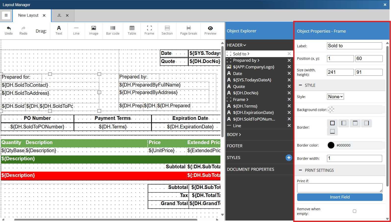
When you select an object in the Object Explorer the Object Properties will open. Different options will display depending on the object type.
•Frames
oLabel - This is the name used to identify the frame.
oPosition - View or change where the object is on the document.
oSize - View or change the size of the object.
oStyle - Apply saved or ad-hoc styling. For more information see Style.
oPrint Settings - Set the conditions as to when the object should or should not be printed. For more information see Print Settings.
•Text
oText - This is the text that will display on the document. If this is a data field it will show the macro for the selected field.
oRich text - This opens a rich text editor that allows you to dynamically format fonts directly from within the object properties window.
oEvaluate - Treat the text as a calculation and evaluate the expression based on Python syntax.
oPosition - View or change where the object is on the document.
oSize - View or change the size of the object.
oStyle- Apply saved or ad hoc styling. For more information see Style.
oPrint Settings - Set the conditions as to when the object should or should not be printed. For more information see Print Settings.
•Image
oSource - Select a data field that you would like to pull the image into the document.
oImage File - Select a file that you would like to use for your image.
oPosition - View or change where the object is on the document.
oSize - View or change the size of the object.
oStyle - Apply saved or ad hoc styling. For more information see Style.
oPrint Settings - Set the conditions as to when the object should or should not be printed. For more information see Print Settings.
•Line
oPosition - View or change where the object is on the document.
oSize - View or change the size of the object.
oStyle - Apply saved or ad hoc styling. For more information see Style.
oPrint Settings - Set the conditions as to when the object should or should not be printed. For more information see Print Settings.
•Table
oData Source - Select which QuoteWerks table you would like to pull data from.
oPosition - View or change where the object is on the document.
oColumns - Set how many columns you would like the table to have.
oHeader - Toggle whether or not you would like a header row to be included in the table.
oContent rows - Set how many rows you would like the table to have.
oFooter - Toggle whether or not you would like a footer row to be included in the table.
oStyle - Apply saved or ad hoc styling. For more information see Style.
oPrint Settings - Set the conditions as to when the object should or should not be printed. For more information see Print Settings.
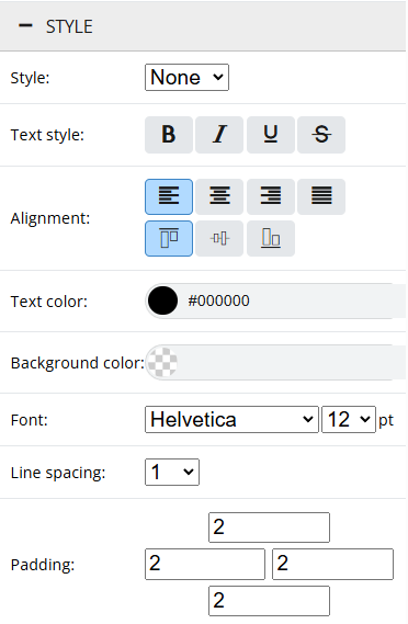
Style can be used on a number of different objects as outlined above. Style options will be different depending on the type of object you have selected. The style options pictured above are for a Text element. Some of the common Style options are listed below.
•Style - Select a pre-saved style to be used by the selected object. See Saved Styles.
•Text Style - Make text bold, italicized, underlined, or strike through.
•Alignment - Align text within the containing element.
•Text Color - Set the text color to be used by the object.
•Background Color - Set the background color of the object.
•Font - Set the font of the object.
•Line Spacing - Set the line spacing for the selected object.
•Border/Border Color - Set the border and color for the selected object.
•Border Width - Set the border width for the selected object.
•Padding - Set padding for the selected object.
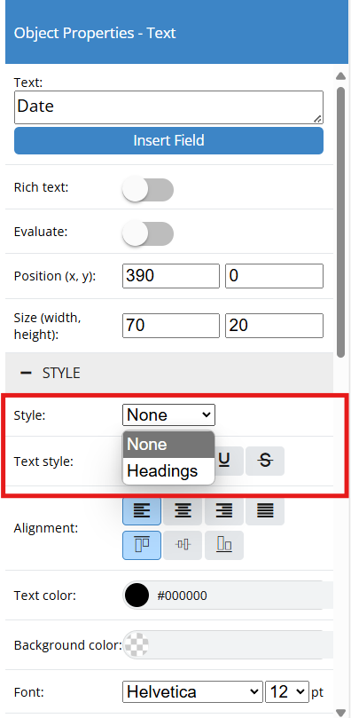
Styles can be saved to be reused on different objects. Once a style has been saved, it can be applied by selecting it from the style drop down when within the object properties for that object type. For example, if you wanted all of your heading to share a certain style you could create a saved style called Headings. Anytime you are creating a heading you can select Headings from the drop down and the saved style will automatically be applied to the object.
To set a new saved style click on the  (plus button) next to Styles in the Object Explorer.
Doing so opens the Object Properties - Style side panel.
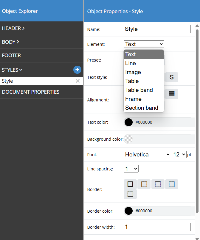
Here you will want to give your style a name and select the element type you would like this style to apply to. You can then configure the style in whatever way makes the most sense given your design intent.
Now, when you go to edit the object properties for an element that has a saved style, you will be given the option to apply that saved style to the element using the drop down menu.
Object Properties - Print Settings
Print Settings allows you to control when an object prints to the document. Line Types and Line Attributes can be used to create functions that determine when an object will or will not print and in some cases how the object will print. Each object type has slightly different print settings, but for simplicity, here is a list of the different print options you may encounter:
•Print if - This field controls when an object will or will not print. See Below.
•Remove when empty - This option will not print the object when there is no value for it.
•Shrink to content height - This option will shrink the object to the height of its container if the text does not take up all of the allotted space.
•Align to bottom of page - This option will align the object to the bottom of the page.
•Always on same page - This option will print the object on the same page and force a page break should it extend on the the next one.
•Pattern - This option allows you to set how you want the text to be formatted. This is especially useful for dates or numbers. ie. you can set the date format to be MM/DD/YYYY, DD/MM/YYY, etc.
•Link - This field allows you to add a hyperlink to your layout.
The Print if field is used to control when an object will or will not print. This is done using expressions that call upon different tables and fields to create a filter for the object. The Print if feature can be used on individual objects or on sections/frames.
To create a Print if statement start with the field you would like to filter by. Most often this will be either Line Type or Line Attribute. As a shortcut, Line Types and Line Attributes have been created as constants in the Layout Manager Database. This means you do not have to remember the specific line type or attribute value in the QuoteWerks system, but rather only the constant. You can still create Print if statements using the back end value, as demonstrated below.
Example 1 - Print only when the line type is equal to a product or service
${LineType}==${:CON.TypeProductService}
OR
${LineType}==1
Example 2 - Print only when the line type is equal to a heading
${LineType}==${:CON.TypeHeading}
OR
${LineType}==256
Example 3 - Print only if there are recurring items on the quote and the first payment is included in the total
check_flag(${LineAttributes}, ${:CON.AttributeIsRecurring}) and ${RecurringFirstPaymentIncluded} != '0'
***Notice that expressions can be written either using the constant for product/service OR the back end value for that field. For a listing of the back end values that can be used when creating functions, please see Appendix: Developer Integration Notes.